Technology5 min read
Why Your Phone Is So Hard to Put Down: The Design Tricks Behind Endless Scrolling
Infinite scroll, pull-to-refresh and the little red badge were not accidents. Some of the people who invented them now say they regret it. Here is how they work on your brain, and what you can do about it.
You pick up your phone to check the weather. A notification catches your eye, so you open it. Then you glance at another app, just for a second. Then you look up, and it is somehow forty minutes later, and you can't remember a single thing you saw.
Most people have had this experience so often that it barely registers. It is tempting to treat it as a personal weakness, a lack of willpower. But a lot of what happens in those forty minutes was designed, deliberately and skilfully, by teams whose success was measured by how long you stayed.
Understanding those designs won't make you immune to them. It does make them a lot easier to notice, and noticing is where control begins.
The page that never ends
For most of the early web, pages had a bottom. You reached the end of a list of search results or a blog's front page and had to click "next" to see more. That tiny pause was a natural stopping point. It gave your brain a moment to ask: do I actually want to continue?
Infinite scroll removed that moment. Content simply keeps loading as you move down the page. The designer Aza Raskin is widely credited with creating the pattern in the mid-2000s, intending it as a convenience. He has since become one of its most prominent critics. In interviews, including one with the BBC in 2018, he has described the effect in stark terms, comparing it to sprinkling something like behavioural cocaine over an interface, and estimating that it wastes the equivalent of enormous numbers of human lifetimes every day.
The principle behind the problem is simple. Humans rely on stopping cues: the end of a chapter, the bottom of a plate, the credits of a film. Remove them, and we tend to keep going far longer than we would have chosen to.
The slot machine in your pocket
The second ingredient is unpredictability. In the mid-20th century, the psychologist B. F. Skinner showed that animals pressed levers most persistently when rewards arrived on a variable schedule: sometimes after one press, sometimes after twenty, never predictably. Regular rewards produce steady behaviour. Unpredictable ones produce something closer to compulsion.
Gambling machines are built on this principle, and so, in a gentler form, are social feeds. Most of what you scroll past is unremarkable. Every so often, there is something genuinely funny, flattering or shocking. You never know which swipe will deliver it, so you keep swiping.
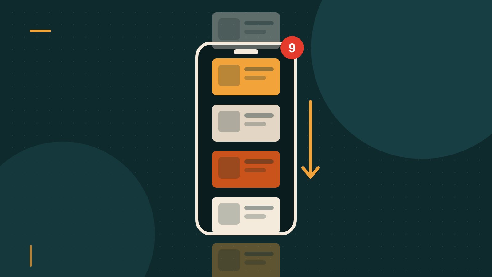
Pull-to-refresh, the gesture of dragging a feed downwards to load new content, makes the comparison almost literal. Its inventor, the developer Loren Brichter, created it for a Twitter app in the late 2000s. He later told interviewers that he regretted some of the side effects and acknowledged that the gesture works a little like pulling the lever on a slot machine: a small physical action, a brief pause, and then the reveal.
Red dots and other tiny nudges
Then there are notifications. The little red badge with a number on an app icon is one of the most effective attention grabbers ever invented. Red signals urgency. A number signals an unfinished task. Your brain, which dislikes loose ends, wants the number to go away.
Many notifications are not about anything urgent. They are prompts to return: someone you barely know posted for the first time in a while, a video is trending, you have "memories" from three years ago. Each one is a small hook, cast at a moment chosen by an algorithm rather than by you.
Autoplay works the same way for video. When the next episode or clip starts automatically, stopping requires an action, while continuing requires nothing. Default settings are enormously powerful, because most people never change them.
Is this manipulation?
The technology industry has argued about this for years. Defenders point out that every successful product tries to be engaging. Novels have cliffhangers. Television has "previously on" and "next time". Nobody calls a page-turner a dark pattern.
Critics, including the former Google design ethicist Tristan Harris, who went on to co-found the Center for Humane Technology, argue that the difference is scale and precision. A novelist doesn't watch millions of readers in real time and adjust the next chapter to maximise how long each one keeps reading. Modern platforms can, and do, test countless variations to see which ones keep people engaged for longer. When the business model depends on attention, the system will tend to optimise for attention, whether or not that time is good for the person spending it.
The fairest conclusion may be that most of these features are not evil in themselves. Infinite scroll is genuinely convenient. Notifications can be useful. The problem is what happens when they are tuned, relentlessly, for a single metric that has little to do with your wellbeing.
Taking back the stopping cues
The good news is that the same psychology that makes these designs effective also suggests how to blunt them. You don't need to throw your phone into a lake. You need to put back some of the friction that was removed.
Turn off non-human notifications. A useful rule of thumb is to allow notifications only when a real person is trying to reach you directly: messages, calls, perhaps a calendar reminder. Everything else, from likes to trending stories to app suggestions, can wait until you choose to look.
Remove the badges. Most phones let you switch off the red numbers on app icons. The messages are still there when you open the app. They just stop shouting at you.
Move the most tempting apps. Taking them off your home screen, or putting them in a folder on the last page, adds a few seconds of effort. That tiny delay is often enough for the automatic reach to turn into a conscious decision.
Try greyscale. Colour is a big part of what makes screens feel rewarding. Many people find that switching the display to black and white for part of the day makes scrolling noticeably less appealing.
Set your own endings. Use built-in screen time limits, or simply decide in advance: one video, ten minutes, until the kettle boils. An external stopping cue can replace the one the design took away.
Keep the phone out of the bedroom. A cheap alarm clock removes the main excuse for having the phone beside the bed, and with it the most common moments of drifting into a feed: the last thing at night and the first thing in the morning.
The bigger picture
Individual habits help, but they put the whole burden on the user. Some designers and policymakers argue that the responsibility should be shared. Regulators in several places have started looking more closely at "dark patterns", design choices that steer people into decisions they wouldn't otherwise make, and at how platforms treat younger users in particular.
Meanwhile, some of the people who built the attention economy are now among its sharpest critics. Their message is not that technology is bad, but that it should be designed to respect the limits of the human mind rather than exploit them.
The next time you surface from a forty-minute scroll, try not to feel guilty. Instead, ask a more useful question: what removed my chance to stop? Once you can see the design, you can start choosing when to step out of it.